


 Reply With Quote
FAYT!!!
The other sigs are cool too.
10/10!


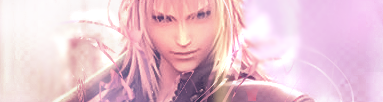
There's a tiny, tiny bit of a white blur still left on the hair of the render, but I noticed it becomes unnoticeable on Light, though. I also like how you make the top font black but with a white stroke so that it'd be visible on both skins. But on the same note, on Light, it seems a bit strange since the bottom portions of the stroke which touch the banner make it look like it's eating away at it; the white is transparent against the white skin. I like the bottom text a lot, though, since it's all shiny and stuff! ^_^ And the quote is nice, too. =)
Also, because I've noticed that your backgrounds are quite simple most of the time, I think it'd bring out the colors more if you fade some text, add a semi-transparent picture of another image of the render, or just randomly put some abstract brush strokes in there and blend them. ^_~
8/10
Last edited by Fate; 04-13-2010 at 04:23 PM.
Curiosity Conquers, So Click:


FAYT!!!
The other sigs are cool too.
10/10!
My soul, corrupted by vengeance
Hath endured torment, to find the end of the journey
In my own salvation
And your eternal slumber
My junk:
Daz 3d! Awesome!
I like the classic sephy lol the only problem I see is it should be I. . . .will never be a memory! that or maybe I'm just crazy
CPC8- 'fo bros, 'fo life, 'fo shizzle
SPOILER!!:


For some reason the pic makes me laugh lol7/10


It would probably look better centered. I got nothing else.
4.356/13.958
Let's go into the "archives" in "Washington D.C." and find out how people "masturbated" in the "roaring 20's."
Crao Porr Cock8. Bitch.


It made me laugh, nothing else to expect from Polk.
8/10
Sig and Avy made by Unknown Entity
The eyeshadow is uneven! NO POINTS FOR EWE!
No, in all sincerity, it's a pretty nice signature lol
9001/9009
Last time I used this everyone ignored it. I expect the joke to be gotten this time lol
CPC8- 'fo bros, 'fo life, 'fo shizzle
SPOILER!!:
ROFL! Brilliant!
7/10!
My soul, corrupted by vengeance
Hath endured torment, to find the end of the journey
In my own salvation
And your eternal slumber
My junk:
Daz 3d! Awesome!
I like your sig, I'll give it a 9.
Currently Playing:


nice, ive heard of carpet bombing but not chicken bombing. i rate it a 9 for making me relive that hell in legend of zelda.


There isn't much going on. 3/10.
You might've gotten a 4/10 if you used proper grammar, or if I understood what the second part of the second line meant...


Render's a little jagged but like all your work, it's soft and soothing that I like! =3
I checked it out on TFF Light and it seemed to work a little better so I give you a 8/10
My things:
I like the monochromatic color scheme you have got going on.It's a good size for a banner, in that you notice it, but it doesn't make your signature ridiculously long (which is something I gotta work on myself. :lol) I like that you're starting to use different brush effects in your work (very nice use of grunge and splatter!), and when you compare it to your early stuff, you can tell just how much you've improved. I really like how you changed up the render of the character in order for her to fit in more nicely with the overall design. Most people would have probably just stuck her in and covered her a bit with brush effects, but it's nice to see that you altered the image. It does lose some focus when you incorporated her into your Avatar (as in she looks fuzzy to me), but that's a different critique for another thread.
I think it's a great banner, and there's nothing that I would change about it.
10/10
Click at your own risk.:
Yeah, I did it at 1:00 a.m., and I forgot to check it on a dark background. Light backgrounds work so well for hiding mistakes. ^^" Thanks for the advice and the compliment.Originally Posted by ViviMasterMage

It's okay, but some of it, including the font, looks kind of jagged. It is more apparent if you switch to TFF Light... Also, I don't really like the video. I like how you incorporated a video into your sig, but it could've been a better video.
I'll give it an 8 out of 10.
Love the sig, you get a nice 10/10 for the design, the brightness, and color usuage. Very nice.
Currently Playing:
6/10 i don't really like it...
Just a quote.
It's a nice quote and I totally agreed with the slaughter of Sephiroth... Twice. Well, if you count the FFVII Elimination Thread, it's actually been 3 times that the guy has died. =3
7/10
My things:
Its like spray paint meets a ninja, looks good. 8/10. its very laxed in color.


Uhhh...Not Enough Info Bro & Not Too Spectacular Either, Sorry
3.5/10
Sig. Banner made by: Victoria
Favourite Quote Of The Year: "武器ではなく、それを行使する手を恐れてください"(Fear Not The Weapon, But The Hand That Wields It)
Press This Button To View All My Stuff >>>:
^^^
______________________l l l______________________
/ Been Chilln' & Killin' it since 1992/

freakin' epic
i give it 5 stars
~ Victus per Veneratio ~


2 out of 2
suming it up in 1 word
retarded
VENTUS <3
❒ Single
❒ Taken
✓ Mentally dating Ventus from Birth by Sleep
I LOVE VENTUS ^_^
Ventus Scenes That Made Me Cry:
Ventus: I may have to fight Vanitas after all... If I do guys, i want you to-
Terra: The 3 of us can never be torn apart, alright... I'll always find a way..
Ventus: I'm asking you... as a friend... just... put an end to me
Vanitas: Join me, and together we can make the x-blade
Ventus: I Have a better idea, how about i destroy you both?!
Vanitas: Hahahah The X-blade is made of your heart to idiot, if you destroy it, your heart will vanish forever
Ventus: Whatever it takes, anything to save Terra and Aqua


I have no love for this, shall we say 'LOVELESS'?
------
I call out these prayers to the sky, heavy with thought, see your face.
I carry these memories inside, thoughts of a soul colored by love.
See me grow wings and fly high, passions will die down below.
I burn in a basin of fire, watchers look on as they dance in their merciless sky.
Watching me, watching you.
Not Bad, I Give It A 7/10
If You Put A Little More Pazzaz In It, Your Deffenitly Gonna Get Some Good Attention ^_^
Sig. Banner made by: Victoria
Favourite Quote Of The Year: "武器ではなく、それを行使する手を恐れてください"(Fear Not The Weapon, But The Hand That Wields It)
Press This Button To View All My Stuff >>>:
^^^
______________________l l l______________________
/ Been Chilln' & Killin' it since 1992/
It's reeeeaaaaally loooooong, but I like the banners that you have in your sig. The little animated ninja makes me smile, and the banner that Mistress Sheena (Mistress Victoria now) made for you is well done and goes well with what you like.
I give you an 8/10.
Click at your own risk.:


I always enjoy your sigs and have since you joined the forum. 8.5/10 which is very high in my books seeing I don't give out 10s anymore.
So yeah I was bored and a little tipsy last night and decided to play around in paint.net so here is it. Love it, hate it, kill it if you want to.
Soldier: "We suck but we're better then you"
We will fight, we will be strong
Together we're marching on
United, we move as one
Our finest hour has just begun
Philmore - Our Finest Hour
Crao Porr Cock8! Need I say more!?My awards:
I'll destroy it, Meier!
It's awfully small which doesn't give Comic Book Guy justice seeing as he's hilarious! Make it bigger, give it a little background like his store and then we'll talk.
7/10
My things:
6/10
the score would be better if i knew who "Vicky" was...jk
its cool
8/10
~ Victus per Veneratio ~


Not bad, not bad... 6/10 (for I do not want to play the part of Simon on this..)
Love it. Plain and simple. Oh wait theres not one. 0/10 gwahahahaahahaaaaa
Soldier: "We suck but we're better then you"
We will fight, we will be strong
Together we're marching on
United, we move as one
Our finest hour has just begun
Philmore - Our Finest Hour
Crao Porr Cock8! Need I say more!?My awards:
7/10 Meier, What The Hell Happened To The Cool Shit You Used To Have? Somewhat Disapointing For Me...I Loved Your Old Stuff Way Better.
Sig. Banner made by: Victoria
Favourite Quote Of The Year: "武器ではなく、それを行使する手を恐れてください"(Fear Not The Weapon, But The Hand That Wields It)
Press This Button To View All My Stuff >>>:
^^^
______________________l l l______________________
/ Been Chilln' & Killin' it since 1992/


Bookmarks