-
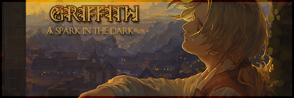
Better than your last sig, which was way too dark and needed some contrast. This one is better, but you need to work on your text. I'm sure you can find some tutorials on text techniques to get new kinds of effects. Otherwise a nice little sig.
8/10
P.S.: Here's a link to a site with a BUNCH of Photoshop tuts. Photoshop Tutorials, Flash Tutorials and More! P2L Tutorial Search
Tags for this Thread
 Posting Permissions
- You may not post new threads
- You may not post replies
- You may not post attachments
- You may not edit your posts
-
Forum Rules


 Reply With Quote

Bookmarks