


 Reply With Quote
Looks great, as usual. I RESENT YOUR GRAPHIC IMAGING SKILLS!
'F you did the avatar the same way I might use it... Undecided as yet. ><
I love it. The colours are great and it's well set out. Godsmack's awesome, too. =D 10/10


Wow!! New banner!! I really like it, Nicely done Lily
However, I'll give you 9/10 just because it not like this


Looks great, as usual. I RESENT YOUR GRAPHIC IMAGING SKILLS!
'F you did the avatar the same way I might use it... Undecided as yet. ><
I love it. The colours are great and it's well set out. Godsmack's awesome, too. =D 10/10
[ Spaghetti ] - [ Petition for FFVIII Remake ] - [ Lily's LiveJournal ]
"Everything dies."
Sig and av are, as usual, made by me.
STOCK IMAGE
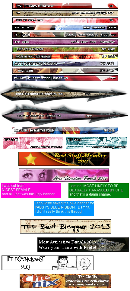
Member of the FF Cult.TFF Family, Quotes and Awards:
This signature was last accurate circa 2010. Keeping for posterity/lols.


i like it, simplistic and yet effective. 8.7 out-o 10
Soldier: "We suck but we're better then you"
We will fight, we will be strong
Together we're marching on
United, we move as one
Our finest hour has just begun
Philmore - Our Finest Hour
Crao Porr Cock8! Need I say more!?My awards:
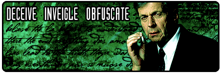
Looks good. The only quip I have is that the text's a little blurred on the banner, but that's about it. ^^ 8/10
[ Spaghetti ] - [ Petition for FFVIII Remake ] - [ Lily's LiveJournal ]
"Everything dies."
Sig and av are, as usual, made by me.
STOCK IMAGE
Member of the FF Cult.TFF Family, Quotes and Awards:
This signature was last accurate circa 2010. Keeping for posterity/lols.


Whoa! Back into the Laguna goodness, eh? Well, you do have the banner for best sig, so who am I to say otherwise?
9.5/10 (Blue is nice ^^)
PS: DO NOT judge my sig!!! It is uber ugly!


It's cluttered feeling, but so is my apartment.
Cluttered is what I'm comfortable in.
Your signature... is comfortable...
...
8/10
The heart is nature's metronome, it counts seconds into miliseconds and even smaller. It beats with time, perpetually; how such a calculating organ became the symbol of love is a mystery to me.
<a href="http://photobucket.com" target="_blank"><img src="http://img.photobucket.com/albums/v426/utilityanpizzazz/sig.jpg" border="0" alt="Photo Sharing and Video Hosting at Photobucket"></a>
<3<3<3
<img src="http://www.freemyspacegraphics.com/Graphics/Funny_Animations/images/Toilet_Dive.gif">
Моя семья
My Bot slicing Brother, Zero
A person diving into a toilet??? That is just awesome! The only weird thing is that there is a stain on the bowl....O_o
I likes the banner too.
9/10 only because I can't read thing over your family area.
I'm in there! Can I join the cult, too?
8/10
[ Spaghetti ] - [ Petition for FFVIII Remake ] - [ Lily's LiveJournal ]
"Everything dies."
Sig and av are, as usual, made by me.
STOCK IMAGE
Member of the FF Cult.TFF Family, Quotes and Awards:
This signature was last accurate circa 2010. Keeping for posterity/lols.


Niiiiiiiiiiiiiiice me is liking muchly, blue niiiice the fading niiiiiice
8/10 niiiice
Wu Tang Killa Bee's, We On The Storm.
Was talking to you as you made it. Looks great - love the effect on the text. The best thing about the re-vampedness is that it's centered.
[ Spaghetti ] - [ Petition for FFVIII Remake ] - [ Lily's LiveJournal ]
"Everything dies."
Sig and av are, as usual, made by me.
STOCK IMAGE
Member of the FF Cult.TFF Family, Quotes and Awards:
This signature was last accurate circa 2010. Keeping for posterity/lols.

As the award you bare states, it's the best...
10/10.
But seriously, great combo
victoria aut mors
I don't get it.
Is it an inside joke and have I been forcefully shoved onto the outside?
This... this must change!
Never in my life have I been more angry. Everything, everything that lives and breathes, everything that is and will be- all of it shall perish at my hands. I shall cause the most cataclysmic chain reaction that has ever been experienced. From this moment on, I am no longer Momo Mastermind Memory Miser, I will now be Eva Braun's sunglasses!
Mwahahahahahaha.
.... -sips some coffee- 8/10
[[Eva Braun was Adolf Hitler's wife.]]
Last edited by Momo Mastermind; 01-04-2008 at 07:03 AM. Reason: ljbnwlg
The heart is nature's metronome, it counts seconds into miliseconds and even smaller. It beats with time, perpetually; how such a calculating organ became the symbol of love is a mystery to me.
<a href="http://photobucket.com" target="_blank"><img src="http://img.photobucket.com/albums/v426/utilityanpizzazz/sig.jpg" border="0" alt="Photo Sharing and Video Hosting at Photobucket"></a>
<3<3<3
<img src="http://www.freemyspacegraphics.com/Graphics/Funny_Animations/images/Toilet_Dive.gif">
Моя семья
My Bot slicing Brother, Zero
That toilet has always made me giggle. But every graphic design major I know has a prejudice against papyrus so I can't see it without laughing now. I like the font you used for "Momo," though. Not as overdone.
8/10, I think.
I'm a little insecure about how big my signature is, but I just made a new banner so here goes nothing.
Curious?
Read more.
TFF Awards:
"I hope I never ridicule what is wise or good. Follies and nonsense, whims and inconsistencies do divert me, I own, and I laugh at them whenever I can."
. SOLDIER ('04) . cHoSeN ('04) . Por Rorr Kitty9 ('09).
HEY DO YOU LIKE MUSIC? Because I make music.
LISTEN HERE!


To be honest, its scary. But in a good way, not in the dracula...i bite you and you die kinda way....which actually...isn't scary? Its very artistic and it just shows everyone how talented you are in making those kinds of signatures. I do love your signatures and enjoy every new one.
I like the border, and especially your name. Its written in such a wicked font, its gold to the eye.
9/10
My Awesome TFF Family


7/10.
I like how you made your name with oranges.?
Proud Member of FF Cult
TFF family, MSN and Dragons:


I can't watch your AMV becuase I have no bandwidth right now =(.
Although it's just white text, it's uncluttered and fairly well structured.
6/10
I've been on this site since 2006 woah

The girl kinda reminds me of you, Froggie, minus the blood and stuff
Last edited by Violet; 01-07-2008 at 05:24 PM.

scary 6/10
Some say he's wanted by the CIA, and that he sleeps upside down like a bat... all we know is, he's called the Stig
Some say that his tears are adhesive, and that if he caught fire, he'd burn for a thousand days... all we know is, he's called the Stig.
Some say that his genitals are on upside down, and that if he could be bothered, he could crack the Da Vinci Code in 43 seconds... all we know is, he's called the Stig.
Some say that the outline of his left nipple is exactly the same shape as the Nürburgring, and that if you give him a really important job to do, he'll skive off and play croquet... all we know is, he's called the Stig.
Some say he isn't machine washable, and all his potted plants are called Steve... all we know is, he's called the Stig.
4/10 kinda small
Soldier: "We suck but we're better then you"
We will fight, we will be strong
Together we're marching on
United, we move as one
Our finest hour has just begun
Philmore - Our Finest Hour
Crao Porr Cock8! Need I say more!?My awards:
I liked Vampire Hunter D a while ago, but I haven't seen it lately. I did like how Carmilla [sp?] was just a phantom in the castle, hanging onto the walls [save for her bloody corpse in the tomb] and such. Meier's head was split in half but surprisingly he put it back together...
It was a sad love story between a vampire, a mortal, and wolf/spirit creatures. I do, however, enjoy a good glass of chocolate soy milk here and there.
As for your "Reach for the stars and shake the heavens." scrolling text, it's very imaginative. I like it, although it is a bit powerful.
All in all, I give your signature nine dead mermaids out of ten.
The heart is nature's metronome, it counts seconds into miliseconds and even smaller. It beats with time, perpetually; how such a calculating organ became the symbol of love is a mystery to me.
<a href="http://photobucket.com" target="_blank"><img src="http://img.photobucket.com/albums/v426/utilityanpizzazz/sig.jpg" border="0" alt="Photo Sharing and Video Hosting at Photobucket"></a>
<3<3<3
<img src="http://www.freemyspacegraphics.com/Graphics/Funny_Animations/images/Toilet_Dive.gif">
Моя семья
My Bot slicing Brother, Zero


hah, lol real funny i like it alot
=
HMMMM........Whats for lunch?
MoonStone Dread Rose....
http://www.youtube.com/watch?v=daA0L...eature=related
http://www.youtube.com/watch?v=0LnP7...eature=related
http://www.youtube.com/watch?v=0eSBYdQeCmg
http://www.youtube.com/watch?v=rLnZ5...eature=related
simplistic yet effective could use a little work 6/10
Soldier: "We suck but we're better then you"
We will fight, we will be strong
Together we're marching on
United, we move as one
Our finest hour has just begun
Philmore - Our Finest Hour
Crao Porr Cock8! Need I say more!?My awards:
lettering is pretty cool 7/10
Some say he's wanted by the CIA, and that he sleeps upside down like a bat... all we know is, he's called the Stig
Some say that his tears are adhesive, and that if he caught fire, he'd burn for a thousand days... all we know is, he's called the Stig.
Some say that his genitals are on upside down, and that if he could be bothered, he could crack the Da Vinci Code in 43 seconds... all we know is, he's called the Stig.
Some say that the outline of his left nipple is exactly the same shape as the Nürburgring, and that if you give him a really important job to do, he'll skive off and play croquet... all we know is, he's called the Stig.
Some say he isn't machine washable, and all his potted plants are called Steve... all we know is, he's called the Stig.
small, but cool, i like it, kinda small.....
HMMMM........Whats for lunch?
MoonStone Dread Rose....
http://www.youtube.com/watch?v=daA0L...eature=related
http://www.youtube.com/watch?v=0LnP7...eature=related
http://www.youtube.com/watch?v=0eSBYdQeCmg
http://www.youtube.com/watch?v=rLnZ5...eature=related
I agree with Meier Link
simplistic yet effective could use a little work
cool, 8/10 for me, i liked iy
HMMMM........Whats for lunch?
MoonStone Dread Rose....
http://www.youtube.com/watch?v=daA0L...eature=related
http://www.youtube.com/watch?v=0LnP7...eature=related
http://www.youtube.com/watch?v=0eSBYdQeCmg
http://www.youtube.com/watch?v=rLnZ5...eature=related
.hack stuff, awesome, but could use a nice banner or something ^^
by the way, if you have any good links for me to watch some of it, please send.(via private message of course) I remember watching some .hack//sign when I was younger, but it sorta dissappeared on me. ^^
7.5/10
bty, if yo ulik e.hack, theres an onine games based on the //G.U. seires, im an admin, ask if you want the site, nice simOriginally Posted by Darkwolf

HMMMM........Whats for lunch?
MoonStone Dread Rose....
http://www.youtube.com/watch?v=daA0L...eature=related
http://www.youtube.com/watch?v=0LnP7...eature=related
http://www.youtube.com/watch?v=0eSBYdQeCmg
http://www.youtube.com/watch?v=rLnZ5...eature=related
Er, that's rather off topic. Could you please rate the above sig, at least?
Anyway, it could really use some work. Change of font, image, embedded video instead of links, maybe? Centering? Formatting really couldn't go amiss here. 4/10, sorry.
[ Spaghetti ] - [ Petition for FFVIII Remake ] - [ Lily's LiveJournal ]
"Everything dies."
Sig and av are, as usual, made by me.
STOCK IMAGE
Member of the FF Cult.TFF Family, Quotes and Awards:
This signature was last accurate circa 2010. Keeping for posterity/lols.
Awesome! One of your greatest signatures so far


Bookmarks