Originally Posted by
LocoColt04
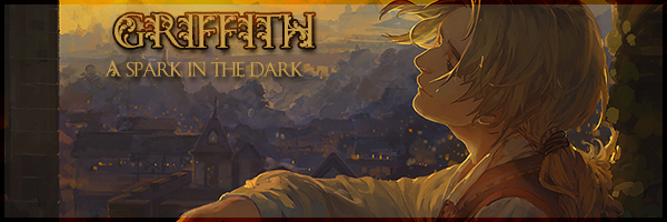
Nice screencap. Not exactly original, but that doesn't take away from its awesomeness. Now, with my massive resolution, I can see that your entire signature is on a single line. Consider putting more breaks in it, like putting the text beneath the image, rather than beside it.
Also, you may wish to make that link of yours an actual hyperlink, rather than plaintext.
Overall, a barely original out of incredibly original.
Don't get me wrong, though. It's still pretty cool. Just a bit bland.
Originally Posted by らぐなろけ
thanks!


 Reply With Quote


 )
)


Bookmarks