


 Reply With Quote
Interesting. I don't know who that is in the picture, but I'm sure they have some personal significance to the person above.
The text is a little difficult because of the colour, but that could be just me.
I'll give it a 6/10.

you get a 1/10 for giving me a 2 hahaha


Interesting. I don't know who that is in the picture, but I'm sure they have some personal significance to the person above.
The text is a little difficult because of the colour, but that could be just me.
I'll give it a 6/10.
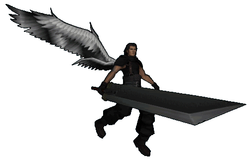
Zackiroth?! if so then ill give it a..
8/10
CPC8... Makin' it happen
Originally Posted by Ruin
Typo's change everything ^
It's not Zackiroth lol it's just plain ol' Angeal
Anyway, the picture is slightly warped, and it seems disorganized to me so. . .
7.93280793287/10/6325675234
CPC8- 'fo bros, 'fo life, 'fo shizzle
SPOILER!!:


Just two casually having a coup of tea, nothing out of the oridinary. ;P
Anyway it looks decent, 7.
Contact me for signature/avatar request.


Not sure what it's from or whatever, but it's a cool picture.
8/10
7/10 just because..


6/10
Needs A Bit More, But Funny
Sig. Banner made by: Victoria
Favourite Quote Of The Year: "武器ではなく、それを行使する手を恐れてください"(Fear Not The Weapon, But The Hand That Wields It)
Press This Button To View All My Stuff >>>:
^^^
______________________l l l______________________
/ Been Chilln' & Killin' it since 1992/


You've had the same quote for a while. Also, it's a tad bit long, but that's a personal preference. I give you... 7/10 because of quote and length.
Awesome banner.
"I used to be active here like you, then I took an arrow in the knee."
>>>------------->
Suddenly... clutter.:
Warning free for over eight years. Feels good.


The text there is absolutely amazing. I love how you took creative text to a new level. It's so fancy that it adds as much effect as fractals, C4D, and the likes. The one minor complaint I have is the blood. It doesn't seem to fit as both the render and text are vivid and sharp, but the blood is the only thing dull in color. Still, I love the art!
9/10
Curiosity Conquers, So Click:
Awesome Banner everything just looks like it was meant to go there originally (i know what i mean)
9/10
CPC8... Makin' it happen
Typo's change everything ^
It looks good on the left where Noctis blends in with the black and there's a faded Lightning. I'm picky about white appearing on edges, though. >_< It also seems to be a rather large banner. Maybe cut back on the width a little and take off a character or two? And some effects would be nice. =3
6/10
Curiosity Conquers, So Click:
I like it
8/10
It's simple and not crowded. 7/10.
"I used to be active here like you, then I took an arrow in the knee."
>>>------------->
Suddenly... clutter.:
Warning free for over eight years. Feels good.


That's pretty cool, though the stroke on the text is a little distracting. Doesn't fit as well with the whole sig.
Still a 9/10, however.
I love how you leave forever, and then return with a brand new sweet ass sig..
9/10
It's very simple, but as a whole your siggy is quite good. :3
8/10
Curiosity Conquers, So Click:
Always impressive, never seen you with a bad sig
9/10


I don't really like it 3/10
Both are pretty cute banners. Perhaps a center tag will give you a ten. I'm also giving you a lower score because the first one has an edge on the top, which I'm guessing isn't supposed to be there. D=
8/10
"I used to be active here like you, then I took an arrow in the knee."
>>>------------->
Suddenly... clutter.:
Warning free for over eight years. Feels good.
Awesome pic from an awesome game
9/10
8/10 I kind of like it
Er, did you make those? The style doesn't seem to be consistent at all between one and the next. But just going off them one by one...
First one: It's too blurry and the border is uneven; it looks like a crop. I like the glow and colours on the render and how it extends to the colours in the background, but the quality is very poor and so the vividness doesn't really work. 6/10
Second one: It's very lovely and has a great sense of flow. I love the way the render is buried in the fractals and effects. The colours are nice, the render is a good quality (as is the banner as a whole), and the text is simple but seems to fit thanks to the fading box behind it. Although, the pink seems like a weird colour choice for that. 9/10
Third one: Again, the quality isn't very good at all. It seems far too pixilated, and the overall design is kind of simple. There's too much of character-space to take up the negative space (that would be there with only the middle render) and not enough effects. Also, that's a hell of a weird place to place a faded eye. xD 6/10
Overall: Just use the middle one. 7.33333333333333/10
Last edited by Fate; 12-06-2010 at 10:22 PM.
Curiosity Conquers, So Click:
I give it a 7/10
Very good quality, not much to say from it though
8/10
CPC8- 'fo bros, 'fo life, 'fo shizzle
SPOILER!!:

8/10
smexy ;3
SPOILER!!:


8.5/10
Nice. And that website looks good.
Please read the poetry from two great friends of mine. May they find peace.
"The truth is like a lion; you don't have to defend it. Let it loose; it will defend itself."
~St. Augustine
I give it 6/10
Ehh it ok, not a huge fan though
6/10


White looks bad on TFF Light... 6/10.


Bookmarks