


It's so easy to destroy and condemn what we do not understand.
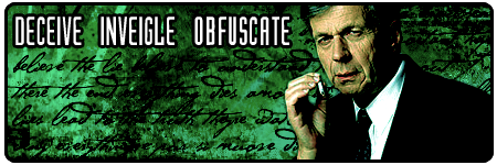
Looks better than the last one. Tones are better, although there hasn't been much work done on it. The text and the border are better. Still too big, and the text beneath it is garish. Althought it does go smashingly with the vibrant crimson of your warn.
Five.


 Reply With Quote
Bookmarks