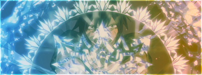
Oh hey, I like your style! ^^ It's quite plain, but it's enough. It's not filled with thousands of effects, you know how to keep it simple but still it looks good.

But nevertheless, I have a few things to say:
Firstly, in your second post, the green signature... It looks better without render, because it just doesn't fit in my opinion. Also, it's very very green. I like that, actually, don't get me wrong. The thing is that there is just green. It would be good to have.. let's say one or two colors more in the pic. (I fail at that, too, but I was told that there should be more color in sigs than just one ^^")
The one thing I love about this sig is this.. tribal (?) on the left side. It really looks good! How did you make that? Or did you find it on the internet?

As for the Catz club signature, I think you see yourself that the image wasn't cut properly. And also the picture doesn't fit. I mean, it looks like a person on a background. There is no.. connection between the pic and the bg. I hope you understand what I mean, I can't put it into clear words I fear. :/

By the way, I like the green sig best. Although it's just green, but it's such a lovely green... <3