Anyone worth their salt in SOLDIER knows that the banner was one of the most definitive characteristics, aside from being renowned as badasses.
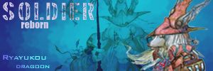
I guess if someone has the ambition and desire to make banners for everyone, this could be a killer idea. Or, if someone still has the retro templates for us to take a look at, that would be incredible as well. If I remember correctly, it was basically the shinra building background (like on the cover of ffvii), at night, with SOLDIER written on one corner and our name in the other, with our image on the right hand side.
Or, we could just make new ones, and by we, I mean not me.
SOLDIER
cHoSeN
Crao Porr Cock8- Rebels, Rogues and Sworn Brothers
Except now we have all of these shiny new Advent Children and, more importantly, Crisis Core images to work with.
New banners for a new age, my friend. I'll work on a template. Something basic. We can go on from that point and decide whether we should all share a single image or go the personalized route.
Community Manager; Forum Administrator
reppin' SOLDIER since 2004 CPC8 class of 2009
Random;:
Originally Posted by 2009 TFF Awards nominations
Best TFF Couple
Martin and Priscilla
Psiko and Hyzenthlay Rocky and LocoColt04 and Meier Link and Pete
Unknown Entity and Mistress Sheena
Originally Posted by Andromeda
I thought I was going to be able to play with Loco and then I remembered he doesn't game. He just turns on the game for an hour and then forgets about it for two months only to remember that he bought it.
Originally Posted by Rowan
Che's not a girl. Not good enough explanation. Please elaborate.
I still have the PSD used to make our old banners (I still HAVE a lot of people's SOLDIER banners). But basically the motif is there and I can still make them.
Of course new is good too, but just so you know...
EDIT: Sorry that was a lie, I don't have the original PSD, just some of the original banners, my bad.
Old design with the new images? Why change what worked? I'm just thinking an update would be pretty badass. I mean, you've seen the new artwork. AC and CC are gorgeous.
Community Manager; Forum Administrator
reppin' SOLDIER since 2004 CPC8 class of 2009
Random;:
Originally Posted by 2009 TFF Awards nominations
Best TFF Couple
Martin and Priscilla
Psiko and Hyzenthlay Rocky and LocoColt04 and Meier Link and Pete
Unknown Entity and Mistress Sheena
Originally Posted by Andromeda
I thought I was going to be able to play with Loco and then I remembered he doesn't game. He just turns on the game for an hour and then forgets about it for two months only to remember that he bought it.
Originally Posted by Rowan
Che's not a girl. Not good enough explanation. Please elaborate.
I know I never had one of the old banners... or did I? If I did, I definitely don't remember. Care to share those old designs? (hence the [img] tag in posts) We can all check out the old stuff and figure out where to go from there.
Community Manager; Forum Administrator
reppin' SOLDIER since 2004 CPC8 class of 2009
Random;:
Originally Posted by 2009 TFF Awards nominations
Best TFF Couple
Martin and Priscilla
Psiko and Hyzenthlay Rocky and LocoColt04 and Meier Link and Pete
Unknown Entity and Mistress Sheena
Originally Posted by Andromeda
I thought I was going to be able to play with Loco and then I remembered he doesn't game. He just turns on the game for an hour and then forgets about it for two months only to remember that he bought it.
Originally Posted by Rowan
Che's not a girl. Not good enough explanation. Please elaborate.
Oh shit, I wonder if I still have all of those. I think they're on the old laptop.
edit:
Although... maybe I should keep looking.
This was back when we did that whole King/Prince bullshit though. Yeah, no. Fuck that, what were we thinking? Seriously.
Community Manager; Forum Administrator
reppin' SOLDIER since 2004 CPC8 class of 2009
Random;:
Originally Posted by 2009 TFF Awards nominations
Best TFF Couple
Martin and Priscilla
Psiko and Hyzenthlay Rocky and LocoColt04 and Meier Link and Pete
Unknown Entity and Mistress Sheena
Originally Posted by Andromeda
I thought I was going to be able to play with Loco and then I remembered he doesn't game. He just turns on the game for an hour and then forgets about it for two months only to remember that he bought it.
Originally Posted by Rowan
Che's not a girl. Not good enough explanation. Please elaborate.
Nicest Female 2006. Best Couple 2006. Nicest Female 2005. Best Couple 2005. Tie for Nicest Female 2004. Best Couple 2004. Flamer of the Week 2005.
"I hope I never ridicule what is wise or good. Follies and nonsense, whims and inconsistencies do divert me, I own, and I laugh at them whenever I can."
. SOLDIER ('04) . cHoSeN ('04) . Por Rorr Kitty9 ('09). HEY DO YOU LIKE MUSIC? Because I make music. LISTEN HERE!
I think we should do the FFVII. I also think it should be the oldschool one, because honestly, we have to have some tradition, and its absolutely not SOLDIER without FFVII. Plus, that image of Cloud going up against Shinra is classic and I think it should be kept.
I like Cesar's banners, but I'm really feeling the old ways on this. We'll make them our own through the images we have in them, but they should inherently be SOLDIER, even if the n00bs don't get it.
EDIT: Ally also brings up a good point. We're so much better than those ****in puppets at the BoD. We're all equals, but just better than everyone else here.
EDIT 2: I type pretty well when I'm hammered, go me!
Last edited by Pete; 04-03-2008 at 11:18 PM.
SOLDIER
cHoSeN
Crao Porr Cock8- Rebels, Rogues and Sworn Brothers
I agree full-heartedly Pete. I really liked Cesar's banners and having each our own special banner is nice, but it really should be linked to FFVII. Are you thinking we have the banners like Cain's?
SOLDIER's back, back... back again... SOLDIER's back... tell a friend!
Keeping in mind that those were the banners from 2005, the last time SOLDIER was brought back and we had a newer theme back then. You know, warrior-related and shit.
FFVII is fine with me. The ShinRa building is a badass backdrop. I still think we should update it to the newer images though, but hey, that's what this thread is for.
Community Manager; Forum Administrator
reppin' SOLDIER since 2004 CPC8 class of 2009
Random;:
Originally Posted by 2009 TFF Awards nominations
Best TFF Couple
Martin and Priscilla
Psiko and Hyzenthlay Rocky and LocoColt04 and Meier Link and Pete
Unknown Entity and Mistress Sheena
Originally Posted by Andromeda
I thought I was going to be able to play with Loco and then I remembered he doesn't game. He just turns on the game for an hour and then forgets about it for two months only to remember that he bought it.
Originally Posted by Rowan
Che's not a girl. Not good enough explanation. Please elaborate.
I think the best bet would be to see the hi-res ShinRa building, and see how it stacks up against the old one. The thing I love about the old banners is that that particular background image is just such a loaded one. It's kinda like saying we're the establishment, BUT we're also just the badass vets.
SOLDIER
cHoSeN
Crao Porr Cock8- Rebels, Rogues and Sworn Brothers
If someone pulls up images you guys want to use I can probably try my hand at it. Though I haven't made too many banners in the last few years.
I think we should also have standardized sizes, but that's just me :x
AFAIK Crisis Core doesn't really have the same image of the Shinra building so our best bet would probably be the opening for Advent Children. Though it still wouldn't be the same as the original FFVII image...
If it's all the same to everyone else, could we keep to smaller banners? Like... height-wise?
They don't have to be tiny, but you know what I mean. Nothing offensively large, but I'm sure whoever puts them together will know that... so... I'm not completely aware of why I'm posting...
Nicest Female 2006. Best Couple 2006. Nicest Female 2005. Best Couple 2005. Tie for Nicest Female 2004. Best Couple 2004. Flamer of the Week 2005.
"I hope I never ridicule what is wise or good. Follies and nonsense, whims and inconsistencies do divert me, I own, and I laugh at them whenever I can."
. SOLDIER ('04) . cHoSeN ('04) . Por Rorr Kitty9 ('09). HEY DO YOU LIKE MUSIC? Because I make music. LISTEN HERE!
I would totally love to have a shot at it; I don't suppose anyone has a .psd file of those old banners? I'm just not sure how to get those banners at the top and bottom (in the signature). I'm probably kidding myself, those are old banners and probably no one has the original, but just wondering. I suppose being imaginative and creative are the key words here.
BTW Ally, I have our banner done. I PMed you the sig.
SOLDIER's back, back... back again... SOLDIER's back... tell a friend!
The image for the FFVII OST would also work well. Granted, it's a different angle, but it's an awesome shot. This is just an idea; I think the original image was still pretty badass.
Community Manager; Forum Administrator
reppin' SOLDIER since 2004 CPC8 class of 2009
Random;:
Originally Posted by 2009 TFF Awards nominations
Best TFF Couple
Martin and Priscilla
Psiko and Hyzenthlay Rocky and LocoColt04 and Meier Link and Pete
Unknown Entity and Mistress Sheena
Originally Posted by Andromeda
I thought I was going to be able to play with Loco and then I remembered he doesn't game. He just turns on the game for an hour and then forgets about it for two months only to remember that he bought it.
Originally Posted by Rowan
Che's not a girl. Not good enough explanation. Please elaborate.
Took inspiration from the original banners but kind of put my own spin on it and added in Crisis Core influences.
Issues:
* Not all images will be the same, so I don't know how to work out name placement and image placement... this just worked out well for mine.
* What kind of images will we be using, and which will we be forbidding? (Photos of actual people, cosplay, fanart, etc?)
* Was thinking of adding a short little tag for each member above the materia crap.
* Not too sure if I'm all that happy with the top left "Member of SOLDIER"
* Do you guys want a border around the banner? Y/n?
EDIT - Uploaded the image to another location so you don't have to click and enlarge.
I also think that in keeping with SOLDIER tradition, we go with only videogame/ anime images, that would be no actual people/cosplayers, etc. For some reason I think this will wind up being more aesthetically pleasing as well, but thats just me
SOLDIER
cHoSeN
Crao Porr Cock8- Rebels, Rogues and Sworn Brothers
It could use some work, IMHO. The fonts are too varied. Having block text on one side and script on the other is a bit mishmashed. The blue border along the top doesn't go all the way across, emphasizing the difference in the fonts even more. On the other hand, the materia is an interesting touch. The border color goes well with the background image, so it doesn't stick out. Go with that theme and edit the top border to have a similar style. It will seem more natural that way, rather than the current collage feel. ^_^ Yeah, I'm a critic. Just my thoughts though.
I was going to comment on the blue bar, but Merlin beat me to it (and I pretty much agree with everything else he said). The bottom right corner looks empty. Personally I'd put the name there. Maybe bevel/emboss it so that it stands clearly in front of the character image.


 Reply With Quote


Bookmarks