


dude! it has a nazi playing a nazi guitar!! that's just awesome! although the sig needs words...
anyway, 8/10


dude! it has a nazi playing a nazi guitar!! that's just awesome! although the sig needs words...
anyway, 8/10
I've been on this site since 2006 woah


nice a lot better than mine, i don't know how to do those... 8/10
nice family
Sometimes people have to much fun
well, i really like yours. You're Sephiroth, just like me! Dark, and evil. is there a better combination?
8/10
I've been on this site since 2006 woah


Love your Seymour sig. It looks really good along with the marriage certificate as well. 9/10
Ooohhh Fishie I like this a lot. I think you did a great job on that banner of Cloud. Super spiffy. It looks like it is bright an mystical all at the same time. 10/10
it's very beautiful, and dark, at the same time. 9/10
I've been on this site since 2006 woah


Hahaha I like tha marriage thing
I never liked Seymour he is just so annoying and his girly middle aged voice was on my nerves on the middle of the game
Though the family thing is cute
The banner is kind of nicely done, you amde it right? Anywhoo 9/10
<center><img src="http://i69.photobucket.com/albums/i44/kinney1328/bob.jpg"></center>
the hardest part about growing up is
letting go of what you were used to
and moving on with something you're not
I don't wanna be in love, I dont wanna be in love
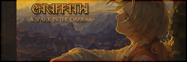
You always have the greatest banners Kinney. I love this one alot. the red roses...the feeling of the picture moves you. The book gives is some class that yanks away from the words. All in all I love it. 10/10


Hey, Kinney:
What she says, and:Originally Posted by cheesevixen
...extra points for that.
20/10
O_O
Ouu,lol hot banner ^_^ Not in the "The girl is hot" kind of way but that the banner is hot, so is the wolf. I like that it actually moves and everything. 10/10
<center><img src="http://i69.photobucket.com/albums/i44/kinney1328/bob.jpg"></center>
the hardest part about growing up is
letting go of what you were used to
and moving on with something you're not
I don't wanna be in love, I dont wanna be in love
Awesome banner, Kinney. Really.
And I remember the times that my name used to be on your sig, but now it's not
Well, I don't really mind though. 10/10
I remember toolol. I like this a lot boco. I think the second banner would look better bigger, but then again I am way too into huge banners. I love the first one. I love chocobo's ^^ Moogles more but still
j/k I like the club banner. Very "in" now an days. An I can't resist clicking the link so 10/10
Well, the truth is that I prefer small banners. So that's why I'm using these. And the truth is that I made none of my banners. The one with the chocobo is made by Musashiden, and the one with Sora is made by Seraphim Shock.
Now yours. I still don't know why a girl has the sexiest banners in the whole forum. Seriously. 10/10
sweet chocobo...if somone was on acid they would be flipping out and the Kindom hearts thing doesn't really do it for me but it's still sweet
9/10
Sephiroth!
Not that big fan anymore ^_^
But that sig is kind of nice
Haha the do you see that evil thing is funny =P
9/10
<center><img src="http://i69.photobucket.com/albums/i44/kinney1328/bob.jpg"></center>
the hardest part about growing up is
letting go of what you were used to
and moving on with something you're not
I don't wanna be in love, I dont wanna be in love
i really like it. i absolutely love the banners, and that thing: "click the link, you can't resist." it works well, trust me. i was at the school library on this page, and a year 8 literally came up over my shoulder and clicked the link. unfortunately, it was blocked
but anyway, 10/10. i love it.
I've been on this site since 2006 woah
The banner's a little large for my own tastes, but it's nice. Very simple, which is definitely a point in your favor. I feel simplicity is better. The image is of a pretty good quality, too. A good find.
As for the signature... you know that Mariko is a WOMAN, right?
Anywho, in terms of numbers... 68982.
Out of... something?
In other words, not bad.
Community Manager; Forum Administrator
reppin' SOLDIER since 2004 CPC8 class of 2009Random;:
Hahaha I like the quote of Malevolence
Nice banners but not my style, sorry ^_^ but still they're very nicely done which I guess gives you more points 9/10
<center><img src="http://i69.photobucket.com/albums/i44/kinney1328/bob.jpg"></center>
the hardest part about growing up is
letting go of what you were used to
and moving on with something you're not
I don't wanna be in love, I dont wanna be in love
I really like your sig Kinney. I like what your sig says as well and I like the moving text too. So honestly, I give it a 10/10.
woo it's highlighted and stuff and you have a family
i see to many Vivi sigs but it's still neat
8/10


T-that thing is sooooo fat !!
Can I poke it ?
9/10
<a href="http://imageshack.us"><img src="http://img340.imageshack.us/img340/4376/animeedenjpgli8.jpg" border="0" alt="Image Hosted by ImageShack.us" /></a>
<a href="http://imageshack.us"><img src="http://i21.photobucket.com/albums/b281/AngelSyren/chasesig1copy.png" border="0" alt="Image Hosted by ImageShack.us" /></a>
Myspace
My Art Gallery
PM Me and Join the Greatest Tyrants Family on TFF
yes you may and also you sig is sweet
TKK all the way...that rhymes anywho... that gunslinger thing is intersting
i like it and just because of TKK 10/10


Its a cute and cool Cait Sith! Its nicely done with a pale-blue theme, cool bubbles and spirals. I love it. The Final Fantasy one is quite nice too, but I prefer the Cait Sith one! It fits better as a signature!
~10/10
PSN username: Raikujaku
A meow-ed member of PRK9
You made that didn't you? Woo, Zell! He rocks! So do you. 10/10 (But I don't really get the Blue Lightning part)


I like it Boco but it may be geting time for a new one but I have had mine for just as long. Well If you want a new one ask me. Any ways with the color and all 9/10.
Thanks


I think the first one is best. It goes with the avy, and has really good text and nice background. The second is a bit weird. The 'Nintendo' doesn't fit in at all.
1st Sig - 8/10
2nd Sig - 3/10
<img src="http://img301.imageshack.us/img301/2958/tifasiggyv2kl8.png">


Rather plain. Interesting, but plain. Not much effects or anything special about it. 6/10
AHHHHHHHHHHH to scary for my likings
but it's nice and graphic
9/10

Simple, but pretty. 8/10
v_v I should get myself a sig...it's empty down there.
I remember when you were happy with a RADISH.
Wow...That's one cool siggie !!*sarcasm*
I'll give it a 10/10 for giving me 10 minutes trying to figure what that means
Yeah,you should get 1.
<a href="http://imageshack.us"><img src="http://img340.imageshack.us/img340/4376/animeedenjpgli8.jpg" border="0" alt="Image Hosted by ImageShack.us" /></a>
<a href="http://imageshack.us"><img src="http://i21.photobucket.com/albums/b281/AngelSyren/chasesig1copy.png" border="0" alt="Image Hosted by ImageShack.us" /></a>
Myspace
My Art Gallery
PM Me and Join the Greatest Tyrants Family on TFF

 Reply With Quote


Bookmarks